For this assignment I have free rein to produce a series of no more than fifteen images that relate to any of the topics covered in the course but must represent a notion of identity or place that I am inspired by.
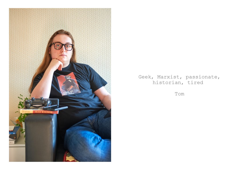
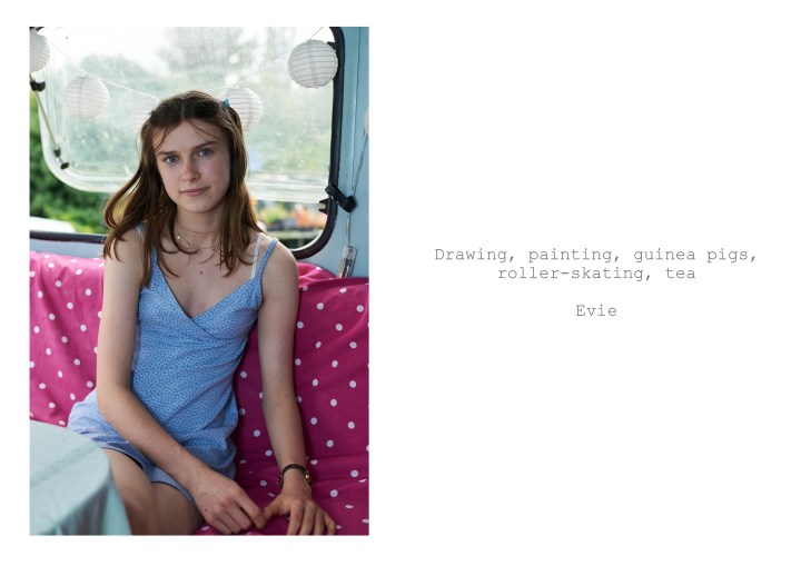
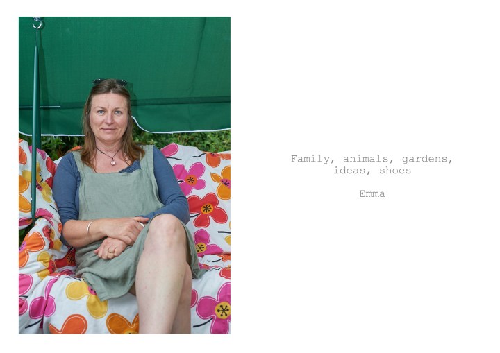
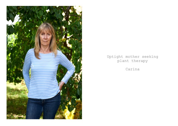
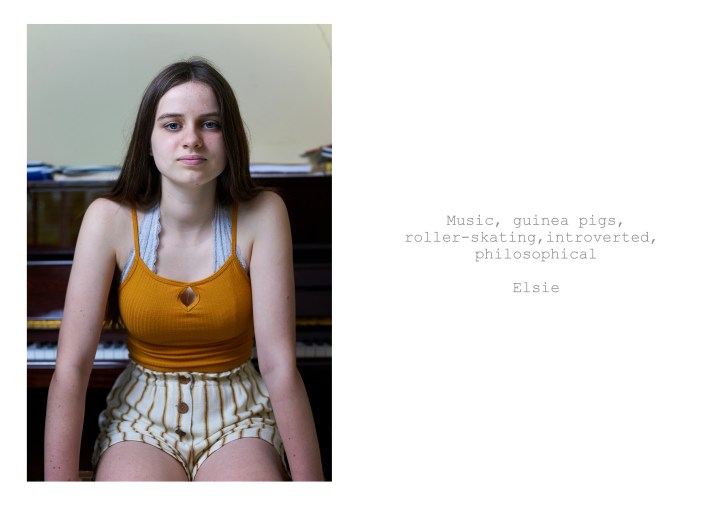
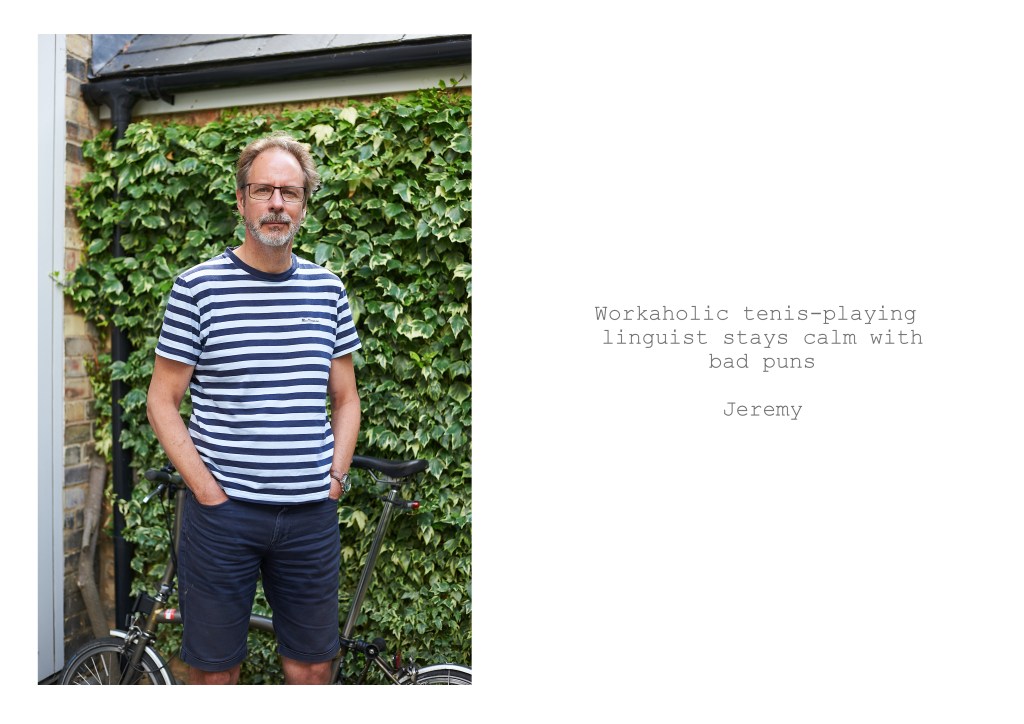
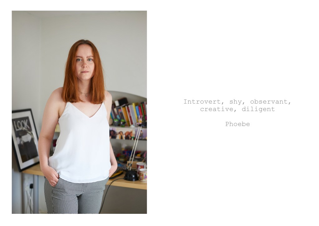
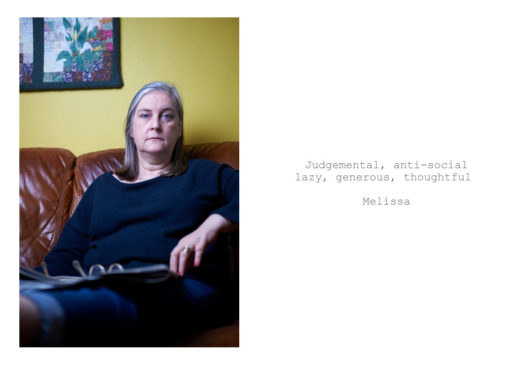
After tackling landscape for assignment four, for this assignment I wanted to revisit portraiture and look at the ideas of identity and self-identity. My aim was to create a series of images that would combine two elements covered in the course, background as context and image and text. My idea was to take portraits of members of my family and to combined them with text provided by the person being photographed. I initially asked the subjects to describe themselves in five words but later added the option of writing a short sentence instead.
The idea was that the text would function as relay, expanding or altering the narrative of the image and would encourage the viewer to question whether the image and text work together to give a more complete understanding of the person in the image, or alternatively, work against each other raising further questions.
Process
I contacted the members of my family who live nearby and asked if they would be willing to participate. I explained that I wanted to photograph them in a place that was meaningful to them and where the background provided some context and gave the viewer some additional information about the figure in the image. I also advised that I would need them to answer the interview question, describe yourself in five words, which I later changed to five words or a short sentence.
The photographs were taken both indoors and outdoors, the locations being chosen by the subjects. For some of the outdoor images I used fill-in flash and for the indoor images I used either natural light, bounced flash and off-camera flash shot through an 80cm soft box. Although the brief for the assignment called for the images to be visually consistent, I was did not want them to be too formulaic and was happy for variations in location, lighting and pose as these decisions were driven by the individuals being photographed. The two factors I tried to keep consistent across the images were, first that the orientation of all the images would be portrait and second that, as far as possible, the subjects should have a neutral expression. In order for the images to be my representation of the people being photographed, I took all the shots before receiving the text from the subjects.
Post-processing of the images was straightforward with some tweaks to exposure, sharpening and minimal cropping. The most challenging element of post production was working out how to produce a double-page spread or diptych as I wanted to ensure that the images and text were given equal weight. After some trial and error I came up with an A3 sized white canvas with the image positioned on the left hand side and the text on the right. After trying seveal different fonts, I decided to use Courier in a mid-grey shade as I thought that black was too stark. The decisions about the layout and font are the ones I am least comfortable about and I think this is because they fall into the area of graphic design, an area which I have very little experience of. Taking on board the feedback from assignment four, I have presented the images in gallery format to ensure that the text is legible.