For this exercise I have to spend some time considering how images and text are presented in the real world.
In the course folder it is suggested that students spend a day without an agenda to complete this exercise. Unfortunately was not able to devote that much time to this exercise, what I did was spend a few hours walking around the centre of Cambridge looking for examples of images and text.
The two main observations were that in the real world images and text are mainly used to advertise and sell products and services; and that although there are examples of anchorage and relay, there a lot of examples that do not neatly fit into Barthes definitions of how images and text work together.
The image below shows an example of text anchoring the image, it is not trying to encourage the viewer to create their own meaning. The picture of the bar is acompanied by text stating, panoramic bar; and the text, afternoon tea, is accompanied by a picture of afteroon tea.
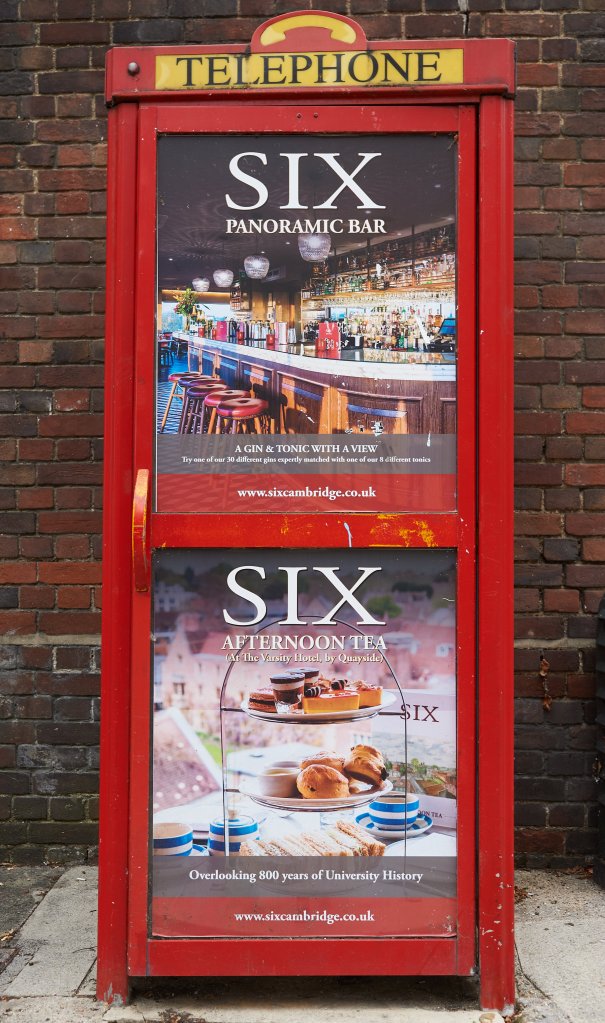
In this instance the images and text are work in tandem almost to prevent viewers creating their own mental image of what the text might mean by accompanying it with images that specifically show them what the text represents. Looking at the image first and then considering the text, the addition of text slightly increases the amount of information available to the viewer, e.g. the bar is panoroamic, there are over thirty varieties of gin, the University of Cambridge is over 800 years old; but none of these pieces of information alters the meaning of the image. I think the intention of the creator was to produce a very clear and unambiguous message because the intended audience is most likely visitors to the city, many of whom are from overseas and may have limited knowledge of English. In view of this, I think the creator has placed a premium on clarity and simplicity rather than subtlety and creativity.
Examples of images with relay text were more scarce, however, there were some.
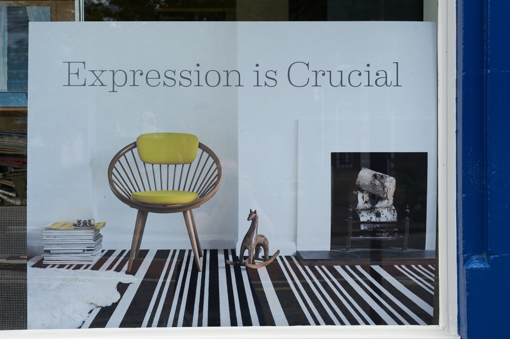
The above image is from the window of a shop selling carpets, therefore I am guessing it is for some brand of carpet, however, from the advert this is not obvious. I like the way the juxaposition of the image and the text implies that choices about furnishings are almost life and death decisions! The irony of this poster is that it is displayed in a shopfront that would not be regarded as the epitome of of considered, stylish design choices.
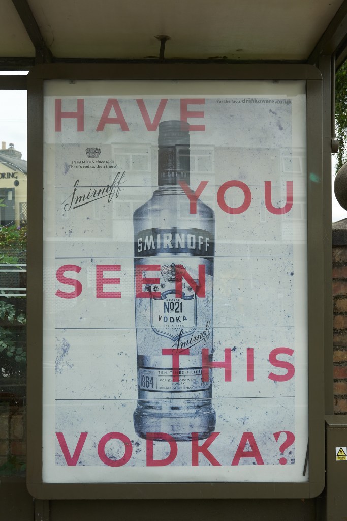
I think this poster for Smirnoff, whilst not as opaque as the previous one, does, just about, qualify as an image with relay text. The text is not defining the characteristics of the vodka and by asking a question it invites a variety of replies; yes, no, who’s wants to know; why, should I have? These responses may go on to alter the meaning of the original image, however, by referencing vodka the text is not as open as in the previous example. I think the creator of this poster has been faced with the problem of how to get people to engage with such a well known brand. By removing the colour from the image of the bottle and combining it with text that asks a question I think they are trying to increase levels of engagement, first by removing some of the viusal cues associated with the brand and second by using the text to prompt a re-appraisal.
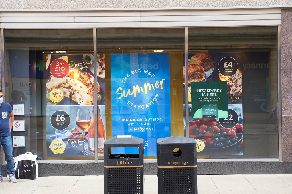
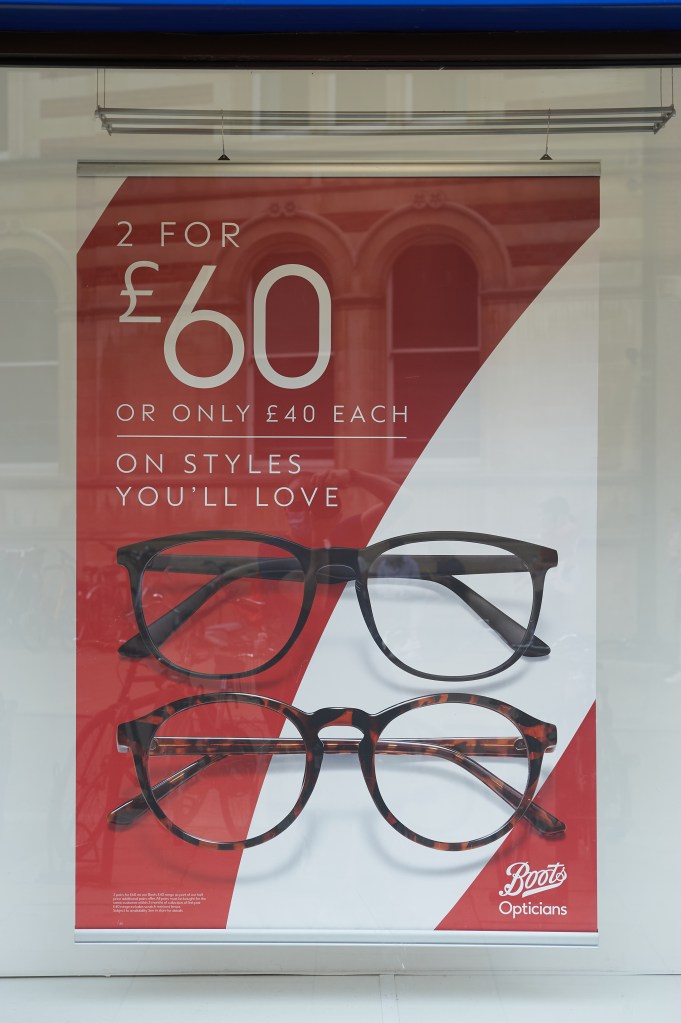
Many of the image and text combinations I saw were sat somewhere between anchorage and relay and I think of them as transactional. The images below are illustrations of this. The text is not purely anchorage, but neither does it invite the viewer to create alternative meanings. The primary function of the text is to communicate value and the image, which appear as secondary elements, serve as visual descriptions of the text.